
Print · 5 min read · November 2026
Why your print looks duller than your phone
It is one of the most common complaints in print: "It looked so bright on my phone, why is the printed version so dull?" The printer gets blamed, the designer gets blamed, and sometimes the job gets reprinted, only to look the same. Usually nobody did anything wrong. Screens and paper simply create colour in completely different ways.
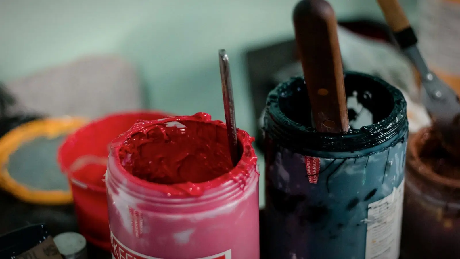
Here is why printed colours look different from screens, what affects them, and the practical steps that get print results closer to what you expect.
01
Screens make light, paper reflects it
A phone or monitor creates colour by shining red, green and blue light directly into your eyes. This is called RGB. Because the screen itself glows, colours can look very bright and saturated, especially on modern phones with vivid display settings.
Paper does not glow. It reflects light from the room, and the colour comes from cyan, magenta, yellow and black inks absorbing parts of that light. This is called CMYK. Printed colours can never be as bright as light coming straight from a screen.
02
Some colours simply cannot be printed
The range of colours a printer can reproduce is smaller than the range a screen can display. Very bright greens, electric blues, neon pinks and vivid oranges often fall outside the printable range. When converted to CMYK, they become duller versions of themselves.
This is why a designer should choose and check CMYK colours for print, rather than relying on automatic conversion at the last moment.
03
Paper changes everything
The same file printed on different papers looks different. Gloss coated paper keeps colours brighter and sharper. Matt coated paper looks slightly softer. Uncoated paper, like letterheads and some cards, absorbs more ink, making colours darker and less vivid.
Lamination also changes colour slightly: gloss lamination deepens colours, matt lamination softens them a little.
If colour accuracy matters, ask for a printed proof on the actual paper before the full run.
04
Your screen may not be accurate
Phones and laptops are often set to boost colours and brightness so they look attractive. Two phones can show the same image quite differently. What you see on your screen is not a reliable reference for how the print will look.
Professional designers use calibrated monitors and printed colour references, but even then, a physical proof is the final check.
05
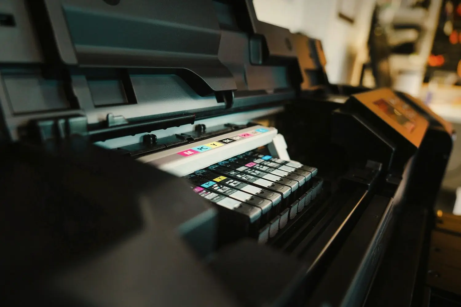
Printers vary too
Different printing machines, inks and operators produce slightly different results. Digital printers and offset presses render colour differently. Reprinting the same file at a different printer may give a noticeably different shade.
For brand colours that must stay consistent, such as logos on packaging, some businesses use Pantone spot colours, which are mixed to a specific formula.
06
How to get closer to what you expect
Ask your designer to prepare print files in CMYK and to choose colours that print well. Look at printed samples of similar colours on your chosen paper. Request a proof for important jobs. Keep the same printer and paper for repeat jobs. And judge the final print in normal daylight, not under yellow shop lights.
Expect print to look different, then plan for it
Print will never exactly match a glowing screen, and that is normal. The goal is a print that looks right on paper: colours that are rich, consistent with your brand and suited to the material. Preparing files properly and checking a proof gets you there.
Judge print colours on paper, in daylight, not on your phone.
Keep a printed reference of your brand colours from a job you were happy with. Show it to new printers so they know exactly what you expect.
Print colour checklist
- Colour mode. Print files prepared in CMYK.
- Colour choice. Brand colours checked for printability.
- Paper. Gloss, matt or uncoated chosen with colour in mind.
- Proof. Printed proof on the actual paper for important jobs.
- Reference. A printed sample of approved brand colours.
- Consistency. Same printer and paper for repeat jobs where possible.
If your brand uses a very bright screen colour, ask your designer for a matching print version that stays as close as possible on paper.
It is also worth deciding which matters more for each job: perfect colour, or speed and cost. A quick batch of flyers may not need a proof, while packaging or a large signboard almost always does. Knowing the difference saves both money and disappointment.
Quick answers
Why do my prints look darker than on screen?
Screens emit light and often boost brightness, while paper reflects light and absorbs ink. Uncoated paper and dim lighting make prints look darker still.
What is the difference between RGB and CMYK?
RGB is used by screens and mixes light. CMYK is used in printing and mixes inks. Some bright RGB colours cannot be reproduced in CMYK.
How can I make sure my brand colour prints correctly?
Use CMYK values chosen for print, check a printed proof on the actual paper, and consider Pantone spot colours for critical brand items.
Related reading
Print files prepared for real paper.
Every print job I prepare uses CMYK colours checked for printability, with advice on paper and proofs. Brochure design starts at ₹1,500 per page. Send me what you need printed.