
Design · 5 min read · November 2026
Brand colours that work everywhere
Most small businesses pick their colours by feel. The owner likes blue, or the competitor down the road uses red, so they go with something different. Then the colour that looked perfect on the phone turns dull on the visiting card, harsh on the signboard and hard to read on the website.
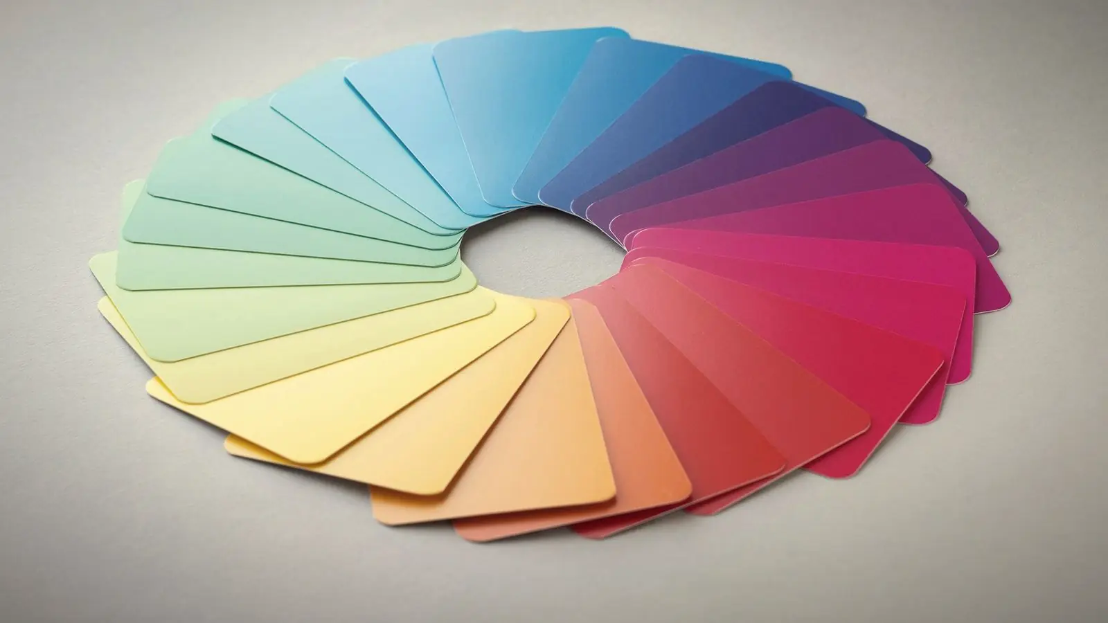
Choosing brand colours is less about finding a beautiful shade and more about choosing a small set of colours that stay consistent and readable everywhere your business appears. Here is the process I follow with clients.
01
Start with one main colour
Your main colour is the one people should remember: on the signboard, the logo, the shop bags and the website buttons. Choose one, not three. A business that uses five equally strong colours is hard to recognise from across the street.
Think about what the colour needs to say. Calm blues and greens are common for clinics and finance. Warm reds and oranges suit food and energy. But meaning matters less than distinctiveness: if every clinic in your area uses blue, a deep teal or a warm green will be remembered more easily.
02
Add supporting colours
Next, pick one or two supporting colours. One is usually a neutral, such as a dark grey, off-white or warm beige, used for backgrounds and text. The other can be an accent used sparingly for highlights, offers or buttons.
A simple rule that works for most businesses: around 60% neutral, 30% main colour and 10% accent. It keeps designs calm while your main colour still stands out.
03
Check contrast before you fall in love
A pale yellow or light grey can look lovely in a mood board and be unreadable as text on a white background. Test your main colour with white text on it and dark text on it. If neither is easy to read, it will cause problems on buttons, banners and social posts.
This matters for older customers and for anyone reading on a phone in bright sunlight, which is most people in Chennai most of the year.
04
Test on print, screen and signboard
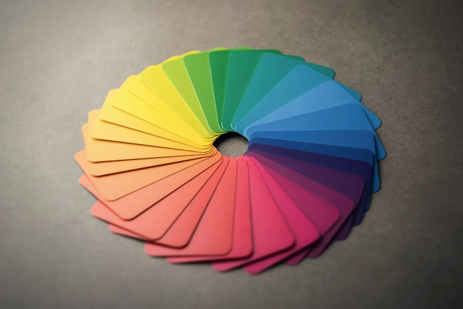
Screens show colours by mixing light (RGB). Printers use ink (CMYK). Some very bright screen colours, especially neon greens, electric blues and hot pinks, simply cannot be printed and come out dull on paper.
Flex and vinyl signboards add another change: colours shift depending on the material and the printer. Before you finalise, print a test of the logo on normal paper and, if possible, ask your sign maker for a small sample. It is much cheaper than reprinting a board.
Ask your designer to give you HEX codes for screens and CMYK values for print. The CMYK version should be chosen by eye, not just converted automatically.
05
Think about where the colour lives
Consider the places your brand will actually appear: a white shop front, a dark Instagram grid, a uniform, a product label, a vehicle. A colour that only works on white backgrounds will limit you. Make sure your logo also has a white or reversed version for dark spaces.
06
Write it down and stick to it
Once chosen, put the colours and their codes on a single page and share it with everyone who makes anything for your business: printers, web developers, the person who makes your social posts. Consistency is what turns colours into recognition. Changing the shade every few months undoes that.
Recognition comes from repetition
No colour is magic on its own. What makes customers recognise a business is seeing the same colours, used the same way, again and again: on the board, the bag, the bill and the post. Pick a small palette that works everywhere, then use it consistently for years.
A brand colour is a promise to look the same tomorrow as you did today.
If your current colours already have customer recognition, adjust carefully rather than starting again. A slightly deeper shade or better contrast is often enough.
Brand colour checklist
- Main colour. One colour people should remember.
- Neutral. A background and text colour for most of the space.
- Accent. Used sparingly for offers and buttons.
- Contrast. Text is easy to read on and with each colour.
- Print test. Checked on paper and, if possible, signboard material.
- Codes. HEX, RGB, CMYK written on one shared page.
Five colours is plenty for a small business. Most need three.
Before you sign off, put the logo and colours on three quick mock-ups: a visiting card, an Instagram post and a shop board. If the palette looks right on all three, it will work almost anywhere you need it.
Quick answers
How many brand colours should a small business have?
Usually three: one main colour, one neutral for backgrounds and text, and one accent for highlights. Some businesses add a second neutral, but more than five becomes hard to keep consistent.
Why do my brand colours look different when printed?
Screens mix light while printers use ink, so some bright screen colours cannot be reproduced on paper. A designer should choose CMYK values by eye for print rather than relying on automatic conversion.
Should I choose my brand colour based on colour psychology?
It can guide you, but being different from your local competitors and readable everywhere matters more than general colour meanings.
Related reading
Colours chosen to work on every surface.
As part of my graphic design and logo work, I build a small colour palette with print and screen codes, tested on paper before it is final. Logo design starts at ₹8,000. Tell me about your business.