
Video · 5 min read · October 2026
Reel covers: the shop window of your profile
When someone taps on your profile from a reel they liked, the grid is what they see next. If it is a mess of blurry random frames, half-closed eyes and cut-off text, they leave. If it is a tidy set of clear covers that show what each reel is about, they keep browsing, and often follow.
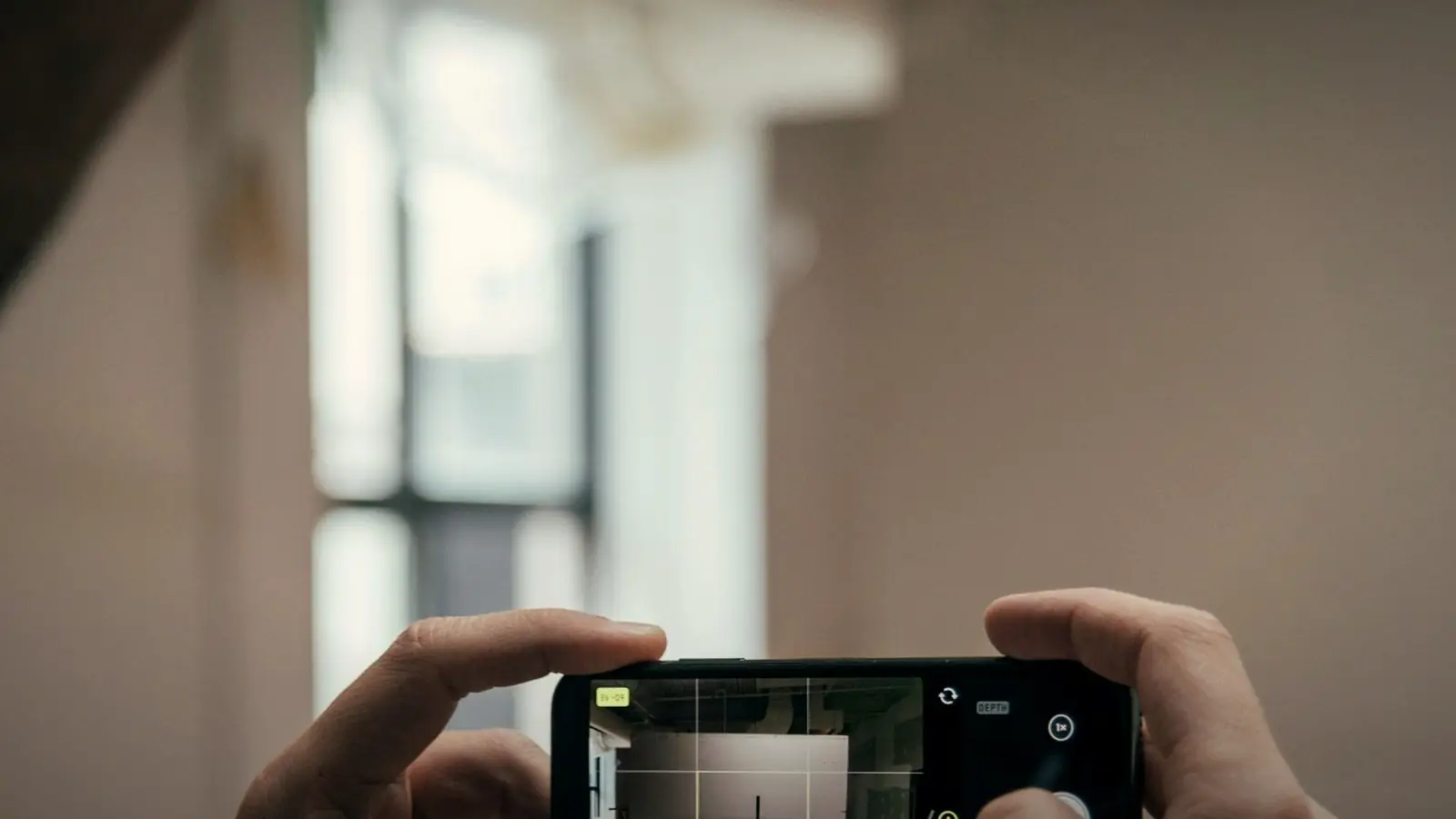
Here is how reel covers are displayed and cropped, what makes a cover effective, how to keep a consistent style without much effort, and when a frame from the video is enough. Instagram changes its grid layout from time to time, so check how covers currently display before designing a template.
01
Why covers matter
Reels play automatically in the feed, so the cover is not what first attracts a viewer there. But on your profile grid, in the Reels tab and in some search views, the cover is what people see. It tells them what each reel is about and whether your profile is worth exploring. A strong set of covers turns profile visits into follows and enquiries.
02
Understand the crop
Reels are 9:16 vertical, but the profile grid shows a cropped version, which has changed shape over the years. Anything near the top and bottom edges may be cut off in the grid. Keep the important part of the cover, especially text and faces, in the central area, so it reads well both full screen and cropped.
Before designing, preview a test cover on your own profile to see exactly how it is cropped.
03
Text: short and large
Covers with a few words of text, three to six, tell browsers what each reel is about: "Bridal makeup timeline", "3 website mistakes", "Behind the scenes". Use a large, bold, readable font that works at thumbnail size. Avoid long sentences and small text that becomes unreadable in the grid.
04
Choose a strong image
If you use a frame from the video, choose one that is sharp, well lit and shows the subject clearly, ideally with a face that has a natural expression. Blurry motion frames and awkward expressions are common when the app picks a frame automatically. A separate photo taken during the shoot can make a better cover than any video frame.
05
A consistent style
A simple template, with the same font, the same text position and the same colour treatment, makes your grid look organised and recognisable. It does not need to be elaborate. Two or three colour variations, one per content type such as tips, behind the scenes and customer stories, help viewers find what they want.
06
When a plain frame is enough
Not every reel needs a designed cover. For very visual businesses, such as food, fashion and interiors, a strong, well-chosen frame with no text can look better and more natural. The key is choosing the frame deliberately rather than letting the app pick a random one.
07
Upload the cover with the reel
When posting, choose the cover by selecting a frame or uploading a separate image. Some apps and scheduling tools also allow it. It is easier to set covers when posting than to fix them later. Ask your editor to deliver a cover image with each reel, in the right size, so posting takes seconds.
08
Check the grid as a whole
Before posting a new reel, look at how its cover will sit next to the last few posts on your profile. Too many similar colours in a row look monotonous; a cover that clashes badly with everything around it looks out of place. A quick preview, using a grid-planning app or simply a screenshot of your profile with the new cover pasted in, helps keep the overall look calm and consistent.
Your grid is a menu
Think of your profile grid as a menu for new visitors. Clear covers with short labels let them see at a glance what you offer and pick what interests them. Random frames are like a menu with no names on the dishes.
Every cover should tell a stranger what the reel is about.
Spend ten minutes designing a cover template once, and every future reel takes a minute to finish properly.
Reel cover checklist
- Safe area. Text and faces central, clear of the grid crop.
- Text. Three to six words, large and bold.
- Image. Sharp, well lit, natural expression.
- Style. Consistent font, position and colours.
- Delivered with the reel. So it is set at upload, not later.
After a few weeks of consistent covers, look at your profile as a stranger would. It should be obvious what you do and easy to find the reels that matter.
Quick answers
What size should an Instagram reel cover be?
Design it at the reel's 9:16 size, typically 1080 by 1920 pixels, keeping text and faces in the central area so they survive the grid crop. Check the current grid display before finalising.
Should reel covers have text?
Usually a few large words help browsers understand each reel. Very visual businesses can use strong frames without text.
Can I change a reel cover after posting?
Instagram has allowed editing covers for some posts, but options vary. It is simplest to set the right cover when uploading.
Related reading
Every reel delivered with its cover.
My reel edits come with a matching cover in your template, sized for the grid crop. Twelve reels a month is ₹12,000. Send me your profile and I'll suggest a cover style.