
Print · 5 min read · November 2026
Menu cards that help customers order
A menu card is the one piece of design every customer in your restaurant reads, and they read it while hungry and in a hurry. Yet many menus in Chennai are long lists in tiny fonts, laminated sheets with faded photos, or tables of items with no sense of what the kitchen does best.
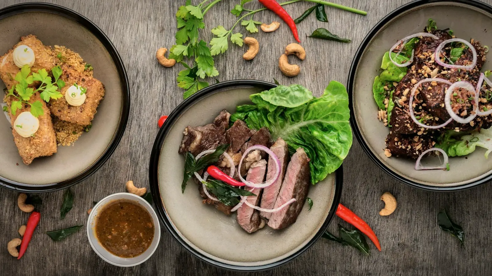
A well-designed menu makes ordering faster, nudges people towards the dishes you want to sell and reflects the quality of your food. Here are the principles I use when designing menu cards for restaurants, cafés and takeaways.
01
Organise into clear sections
Group dishes the way customers think: starters, mains, breads, rice, desserts, drinks. For South Indian restaurants, that might be tiffin, meals, dosa varieties, specials and beverages. Each section should have a clear heading that is easy to find at a glance.
Avoid very long sections. If you have 25 dosa varieties, consider grouping them further, such as classic, stuffed and special, so customers are not scanning a wall of text.
02
Use readable fonts and sizes
Restaurant lighting is often dim, and many customers are older or not wearing their reading glasses. Dish names should be large and clear, at least 11 to 12 points on a printed menu, with descriptions slightly smaller. Avoid fancy script fonts for anything except perhaps the restaurant name.
Good contrast matters too: dark text on a light background, or light text on a very dark background. Text over busy photos is hard to read.
03
Place your best dishes where eyes go first
Customers tend to look first at the top of each section and at anything visually highlighted. Put your signature dishes and higher-margin items there. A simple box, a small icon or a "Chef's special" label draws attention without cluttering the page.
Highlight only a few items per page. If everything is highlighted, nothing stands out.
Highlight dishes that are profitable and that your kitchen makes consistently well, not just the most expensive ones.
04
Show prices clearly but calmly
Prices should be easy to find, aligned consistently next to or below each dish. Avoid long dotted lines that lead the eye straight to the price column, which encourages people to choose by price alone.
Be clear about GST and service charges, and mark portion sizes where they vary, such as half and full plates.
05
Photos: few and good, or none
A few excellent photos of signature dishes can increase orders for those items. Many poor photos, or stock images that do not match what you serve, make a menu look cheap. If you use photos, use your own food, professionally photographed with good light.
Small icons for veg, non-veg, spicy, contains nuts or gluten-free help customers decide quickly. Use the standard green and red veg and non-veg symbols that Indian customers recognise.
06
Tamil and English
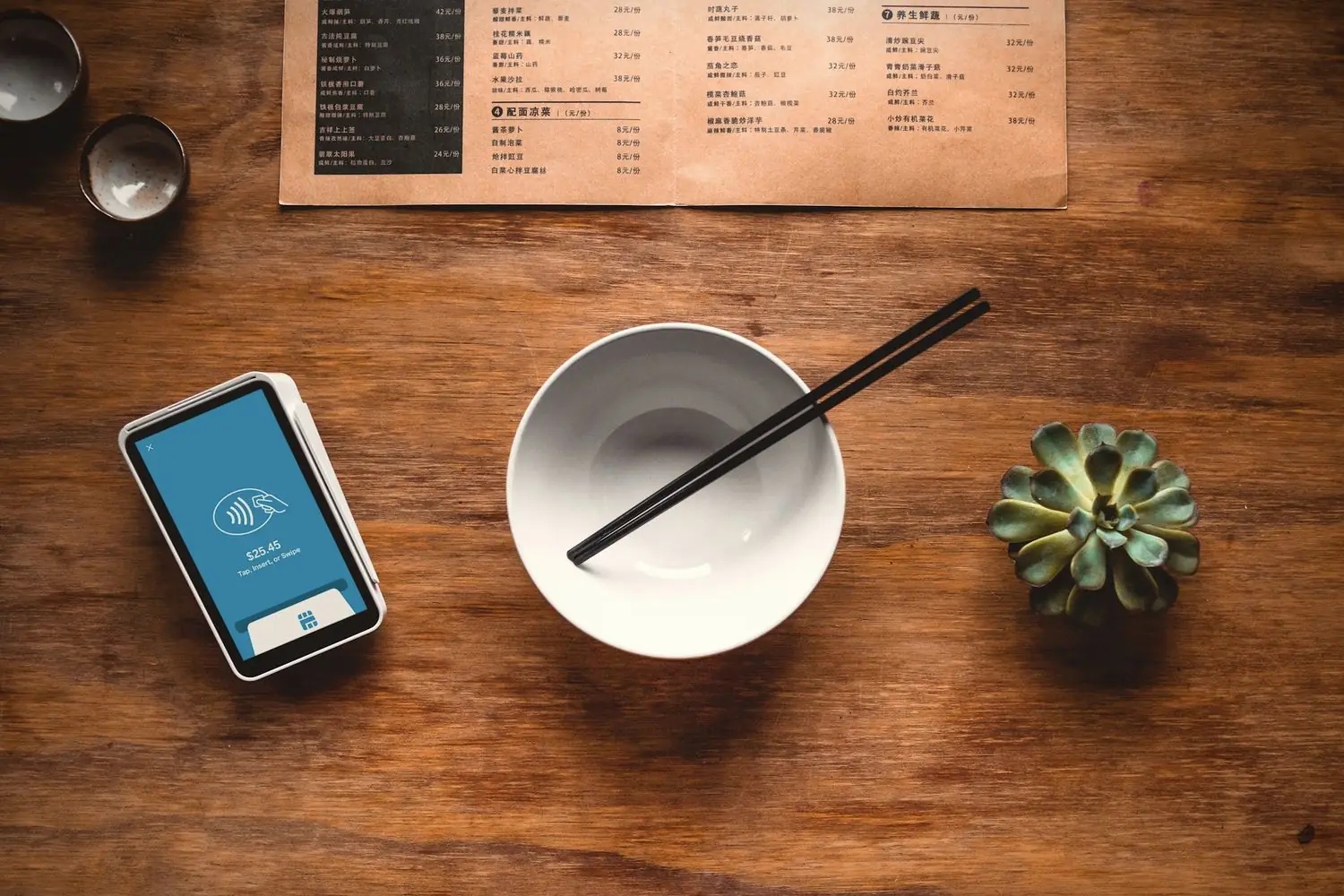
If many of your customers read Tamil, consider bilingual dish names. Give both languages equal care: matching fonts, consistent alignment and correct spelling. A poorly set Tamil line next to beautiful English text looks like an afterthought.
07
Choose durable materials
Menus are handled constantly, often with oily fingers. Thick 300 GSM card with matt or gloss lamination survives much better than plain paper. For fine dining, a menu folder with replaceable inserts allows price updates without reprinting everything.
Keep a digital version too, as a PDF or images for WhatsApp, Google Business Profile and delivery platforms.
A menu is a sales tool
Your menu is the only salesperson present at every table. A clear structure, readable text and a few well-placed highlights help customers order faster and more confidently, and they gently guide them towards the dishes you are proudest of.
If customers keep asking the waiter what's good, the menu isn't doing its job.
Review your menu every six months. Remove dishes that rarely sell, update prices and refresh the highlights based on what customers actually order.
Menu card checklist
- Sections. Grouped the way customers think, clearly headed.
- Readability. Large dish names, good contrast, simple fonts.
- Highlights. A few signature dishes per page, not everything.
- Prices. Consistent placement, taxes and portions clear.
- Icons. Veg, non-veg, spice level, allergens.
- Material. 300 GSM laminated, plus a digital version.
Before printing, ask two or three regular customers to read the draft and order from it. Where they hesitate is where the menu needs work.
Quick answers
What size should a restaurant menu card be?
A4 or A3 folded menus are common, but the right size depends on how many dishes you have. The text must stay readable, so more dishes means more pages rather than smaller fonts.
Should a menu card have photos?
A few high-quality photos of your own signature dishes help. Many low-quality or stock photos make a menu look cheap.
What paper is best for a menu card?
300 GSM card with matt or gloss lamination is durable and easy to wipe clean, which suits menus handled every day.
Related reading
Menus designed to sell your best dishes.
I design menu cards for restaurants and cafés, in print-ready and WhatsApp-friendly versions, in Tamil, English or both. Menu design starts at ₹1,500 per page. Send me your current menu.