
Web · 5 min read · October 2026
Your homepage, section by section
The homepage is where most visitors decide, within seconds, whether they are in the right place. Many small business homepages spend those seconds on a rotating slider, a vague welcome message and a company history. Visitors leave before finding out what the business actually does.
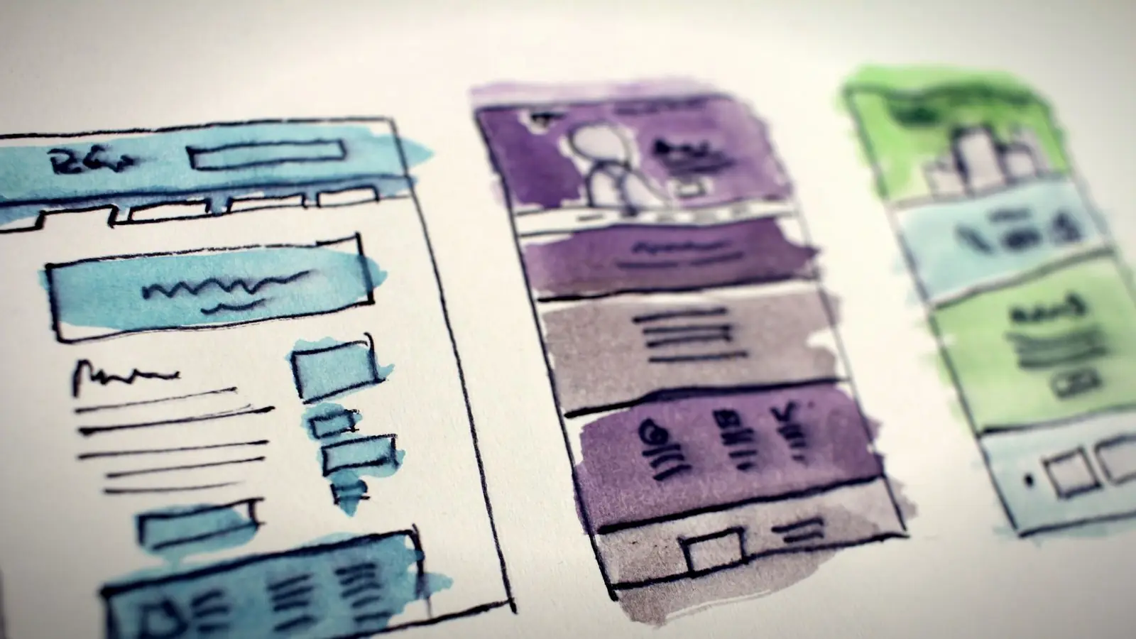
Here is a practical homepage structure that works for most small businesses, section by section, with what each part needs to do and the common mistakes to avoid.
01
1. The first screen: what, where, next
Before any scrolling, a visitor should know three things: what you do, where you do it, and what to do next. A clear headline ("Wedding and corporate video editing in Chennai"), a supporting line about who it is for, and one main button ("WhatsApp for a quote"). A real photo of your work, team or premises helps.
Avoid "Welcome to our website". The visitor knows where they are; tell them what you do.
02
2. Services, briefly
A short overview of your main services, three to six of them, each with a one-line description and a link to its own page. Visitors scan this section to confirm you do what they need. Detailed explanations belong on the service pages, not here.
Use the names customers use for your services, and add a small photo or icon for each if it helps people scan. If you serve two very different audiences, such as homes and businesses, split the services into two clear groups so each visitor finds their path quickly.
03
3. Proof
Something that shows you are good at it: examples of work, short testimonials with names, Google review rating, logos of clients (with permission), years in business, numbers you can stand behind. Real and specific proof builds trust much faster than adjectives like "best" and "top quality".
04
4. How it works
A simple three or four step process: enquire, get a quote, approve, receive. It answers the unspoken question "what happens if I contact them?" and makes taking the first step feel less risky. Add rough timings where you can.
05
5. Pricing hint
You do not need a full price list on the homepage, but a starting price or a link to a pricing page answers the most common question. Visitors who cannot find any indication of price often assume it is too expensive, or leave to find one who shows it.
06
6. Common questions
Three to five short FAQs addressing the main doubts: area served, timelines, payment, guarantees. Link to a fuller FAQ or the relevant service pages for more.
07
7. Contact, again
End with a clear contact section: the main button repeated, phone, WhatsApp, address with a map if customers visit you, and opening hours. On mobile, make the phone and WhatsApp tappable.
08
Mistakes to avoid
Rotating sliders: most visitors see only the first slide, and they slow the page. Long company histories at the top: move them to the About page. Generic stock photos: they make you look like everyone else. Too many buttons with equal weight: visitors hesitate. Huge background videos on mobile: they eat data and delay the first screen.
Also avoid putting important information only in images, such as a banner with your phone number written on it. Text inside images cannot be tapped, is often unreadable on phones and is invisible to search engines.
Order can change to suit your business. What matters is that every section answers a question visitors actually have.
The three-second test
Show your homepage on a phone to someone who does not know your business for three seconds, then take it away. Ask them what you do, where, and what they would tap next. If they cannot answer all three, the first screen needs work.
What you do, where you do it, and what to do next, before anyone scrolls.
Everything else on the homepage supports those three answers. Anything that does not can usually move to another page.
A homepage in seven sections
- Hero. Headline, location, one-line value, main button, real photo.
- Services. Three to six, linking to their pages.
- Proof. Work samples, testimonials, ratings.
- Process. Three or four simple steps.
- Pricing hint and FAQs. Starting prices, key doubts answered.
- Contact. Button, phone, WhatsApp, map, hours.
This structure works for most service businesses, shops, clinics and studios. Adjust the order, but keep the purpose of each section.
Quick answers
What should be on a small business homepage?
A clear headline saying what you do and where, a main call to action, a brief overview of services, proof such as testimonials and work, a simple process, a pricing hint, a few FAQs and contact details.
Are image sliders good for a homepage?
Usually not. Most visitors see only the first slide, and sliders slow pages down. One strong image with a clear headline works better.
How long should a homepage be?
Long enough to answer visitors' main questions and lead them to the next step. Each section should earn its place; detailed content belongs on inner pages.
Related reading
A homepage that passes the three-second test.
I design homepages that say what you do, where and what to do next before anyone scrolls. Five-page sites start at ₹20,000. Send me your current homepage and I'll suggest the first fix.